Brand Design
← Back to All Wins
Designing a Brand Around Leadership, Empowerment & Growth
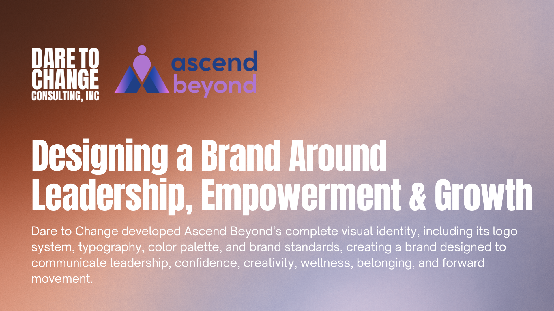
DTC developed Ascend Beyond’s primary logo, secondary logo treatments, standalone icon, typography system, and brand kit as part of the organization’s broader institutional development. The visual identity centers on an abstract mark combining a human figure with ascending geometric forms, reinforcing the organization’s focus on personal development, leadership, community, and helping individuals move beyond existing limitations. Multiple logo variations were created so the identity could remain consistent across organizational materials, programs, social media, events, presentations, merchandise, and other applications.
The brand system uses Montserrat, Inter, and complementary sans serif typography to create a clean, contemporary, and accessible visual language. DTC also developed a broader color system in which individual colors reinforce different dimensions of Ascend Beyond’s mission. Leadership Blue represents confidence, trust, and resilience. Empowerment Gold reflects success, achievement, and empowerment. Innovation Purple communicates creativity, imagination, and bold ideas. Additional colors support themes of community, professionalism, wellness, and optimism, giving Ascend Beyond flexibility to visually differentiate programs while maintaining one cohesive identity.
Rather than developing a logo in isolation, DTC created a brand infrastructure that could grow alongside the organization. The visual system gives Ascend Beyond a consistent foundation for communicating programs across youth leadership, wellness, entrepreneurship, sports, education, and community development while ensuring that each initiative still feels connected to the same institutional identity.
The brand system uses Montserrat, Inter, and complementary sans serif typography to create a clean, contemporary, and accessible visual language. DTC also developed a broader color system in which individual colors reinforce different dimensions of Ascend Beyond’s mission. Leadership Blue represents confidence, trust, and resilience. Empowerment Gold reflects success, achievement, and empowerment. Innovation Purple communicates creativity, imagination, and bold ideas. Additional colors support themes of community, professionalism, wellness, and optimism, giving Ascend Beyond flexibility to visually differentiate programs while maintaining one cohesive identity.
Rather than developing a logo in isolation, DTC created a brand infrastructure that could grow alongside the organization. The visual system gives Ascend Beyond a consistent foundation for communicating programs across youth leadership, wellness, entrepreneurship, sports, education, and community development while ensuring that each initiative still feels connected to the same institutional identity.